Redesigning the MyLIU Course Management Portal
This case study documents the full UX research and design process applied to a real, actively used system for The MyLIU "Manage Classes" portal at Long Island University. The goal in this project is to identify with the existing web experience was failing students. Once identifying the pain points then solve those with a more intuitive, mobile-friendly solution that they could actually rely on.
Working within a five person research team, every stage of the design thinking process: planning and conducting user interviews, auditing existing features, mapping pain points through affinity diagrams, defining a user persona, storyboarding redesign scenarios, prototyping in Figma, and running two rounds of usability testing with real students. The project focused on a specific; high-friction task searching for and enrolling in classes and examined how the current system made that process unnecessarily slow, non user friendly, and undependable.
Below is a phase-by-phase breakdown of the research methods used, what was found, and how those findings shaped the design decisions made along the way.
Phase One: User Research Planning & Interview Preparation
In Phase One, the team defined the scope of user research by identifying the three main interview groups: General 4-year students, student athletes, and transfer students. Having our main focus be the Post campus students and those who relied solely on advisors for scheduling, ensuring interviewees had direct experience with the MyLIU portal. Through strategic thinking, 11 common interview questions alongside targeted follow-up questions for each student subgroup, covering topics like scheduling habits, pain points, mobile vs. web preferences, and desired mobile features.
Phase Two: Feature Analysis of Existing System
In Phase Two, the team conducted a feature-by-feature examination of the MyLIU Manage Classes portal to categorize what worked, what needed improvement, and what was redundant. In this process we discovered that Swap, Drop, and Update functions were clearly laid out but lived as separate entries identified as candidates for consolidation into a single "Edit Classes" menu item. Other discoveries that were negatively affecting the user experience was found involved the "Class Search & Enroll" and "Browse Course Catalog" performed overlapping functions and recommended merging them. Another was the flagging that occurs in the "View Classes" column widths were too wide for mobile screens, making key information inaccessible without horizontal scrolling.
Phase Three: Interview Findings & Synthesis
After conducting 12 interviews across four team members with students spanning education, business, theatre, finance, criminal justice, and psychology majors, simultaneously including student athletes, double majors, and a transfer student. Findings revealed consistent patterns: students spent 20 minutes to several hours registering each semester, frequently relied on Promise Coaches because the portal lacked course designation labels (WAC, Liberal Arts). Many resorted to opening multiple browser tabs simultaneously because navigating back within the portal triggered a full page reload. Double majors specifically noted the system could not display requirements for both degrees at once. Student athletes flagged that early registration priority was inconsistently applied based on honors program enrollment status, not athletics alone.
Phase Four: Affinity Mapping & Pattern Identification
After administering a structured 10-question affinity mapping exercise with a transfer student user to validate portal navigation patterns and surface usability gaps. We have confirmed that tab names were understandable but redundant. Two separate tabs ("Class Search & Enroll" and "Browse Course Catalog") performed the same core task and should be unified. The "Enroll by Requirements" tab returned no results for the transfer student, revealing the feature's inability to handle non-standard enrollment situations. Mobile access was cited as nearly unusable due to oversized table columns that required horizontal scrolling to reveal basic class information.
Phase Five: Persona Development
Using the research findings, the team developed a primary persona representing a general four-year LIU Post undergraduate student. Key persona attributes included the need to view current and future semester schedules, the ability to search, add, drop, and swap classes, and the expectation of a guided experience with minimal steps.
Phase Six: Problem Identification & "How Might We" Statements
The team interpreted the six distinct problems identified in the interviews into problem statements paired with “How Might We” questions to drive solution ideation. The issues addressed included the inability to filter classes by time or course designation, the lack of real-time notifications for schedule changes, the absence of an in-portal communication channel with Promise Coaches, outdated major requirement information with no visible last-updated timestamp, and no way for students to determine which classes fulfilled specific requirements (WAC, Liberal Arts) without consulting an advisor. Each problem statement was accompanied by storyboards.
Storyboard One depicts the current scheduling struggle and redesigned flows for time-based class filtering, course designation search, and push notification opt-in for schedule changes
Phase Seven: Prototyping Tool Investigation & High-Fidelity Wireframes
The team evaluated four prototyping tools: Adobe XD, Figma, Lucidchart, and Microsoft PowerPoint, across four criteria: price, collaboration support, template availability, and navigation support. Figma was selected for its freemium model, real-time multi-user collaboration, template library, and ability to create interactive, navigable mockups that simulate a real application. High fidelity wireframes were built to cover the full student enrollment flow:
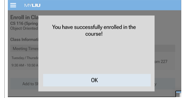
Login → Manage Classes → Class Search & Enroll → term selection → course search → course details → direct enrollment confirmation.

Storyboard Two shows redesigned flows for surfacing course requirement information, in-portal Promise Coach communication with FAQ support, and introducing a split Academic Progress view with a visible "last updated" timestamp.
Phase Eight: Usability Testing, Feedback & Prototype Revisions
Phase Nine: Lessons Learned & Design Process Reflection
The photos presented show an eight-screen wireframe sequence of a student enrolling in a required major class, illustrating the process from login through course confirmation.
The team ran two rounds of usability testing with student participants using a structured test plan that captured both quantitative metrics (task completion rates and click counts) and qualitative metrics (verbal feedback and confusion points). Following the first presentation, three key improvements were implemented: the course description was collapsed into a pop-up to reduce information overload, class height in the schedule view was resized so all courses fit on screen without scrolling, and degree requirements were promoted to the top of the Academic Progress section.
Post–second presentation testing revealed that the “Help” section needed to be accessible from every tab, not just the home screen. Error states for duplicate enrollments were missing, and consistent terminology was needed; “class” and “course” were used interchangeably throughout the prototype, creating learnability issues.
The team reflected on all five stages of the design thinking process (Empathize, Define, Ideate, Prototype, and Test) to identify what worked and what could be done differently. Key takeaways included recognizing that interviewing within close social circles introduced bias that could have been reduced through guerrilla testing. User journey maps were not created during the Define phase, leaving gaps in understanding emotional motivations. A/B testing between a search bar and dropdown menus could have resolved an outstanding design debate. Additionally, Figma’s free-tier limitations (no persistent components and limited interaction types) were not communicated clearly to the client, creating mismatched expectations during the second presentation.